

Perfect Property
A responsive web app for small-scale property buyers to get started in property investment.

Context
Real estate investment is an increasingly popular way for individuals to achieve financial security. It is an exciting and emotional experience, but often complicated. While there are plenty of blogs and agencies providing information, often, buyers new to the market may struggle to get started without professional guidance and waste time viewing properties out of their range. This web app will provide them with the expertise needed to get started efficiently.


My Role: Sole UI Designer
Timeline: 10 weeks
Tools: Sketch, Invision, Flinto
WHO?
This web app is made primarily for new, small-scale property buyers who are looking to invest for additional income or financial security.
WHAT?
This will be a user-friendly, responsive web app containing a database of available residential properties and land, and comprehensive information on each listing.
WHEN?
Buyers will use this tool when conducting property searches, and making a decision about where to invest.
WHERE?
Buyers will use this tool at home or on the go. Users can search for properties anywhere, as long as they’re logged in on a device.
WHY?
Unseasoned buyers need access to reliable, uncomplicated information about their potential property investments. Buyers get a feel for a place by viewing comprehensive information about the property and its neighborhood before spending time on-site.
Process
The project brief was to focus primarily on the UI design. Much of the UX research was already complete, with an established persona, user stories, feature requirements, branding guidelines and icon inspiration.
DEFINE
User Flows
Site Map
Research
EXPLORE
Wire Frames
Usability Testing
Mood Boards
IMPLEMENT
Hi-Fi Prototype
Style Guide
Design Documentation
Persona


Problem
The user needs to have quick access to reliable listings of investment properties, with as much written and visual information about each property and a way of refining searches to suit their individual needs.
Solution
An app which allows users to save their investment criteria, with comprehensive information about each property and the ability to quickly contact real estate agencies when wanting to move forward with a property.
User Flows
I started by creating User Flows for the main features that I wanted to consider.

Lo-Fi Wireframes
I created quick wireframes for the 3 chosen User Flows to visualise the app features and establish its navigation.
Landing Screen

Profile Setup

Home

Set Filters

Call Estate Agent

Email Estate Agent

Mid- & Hi-Fi Wireframes
During the next iteration, I established areas of text, a variety of font size, placed icons and established navigation elements.
Landing Screen

Profile Setup

Profile Setup 2

Signup

Property

I then reviewed the screen, following UI design patterns.
-
[Profile Setup 2] Added a second flow option after search screens to enable the user to view search results rather than signup.


-
[Signup] Reduced the number of input fields on the Signup screen, increasing the space between the input fields, added password hint and an option to show the password.


-
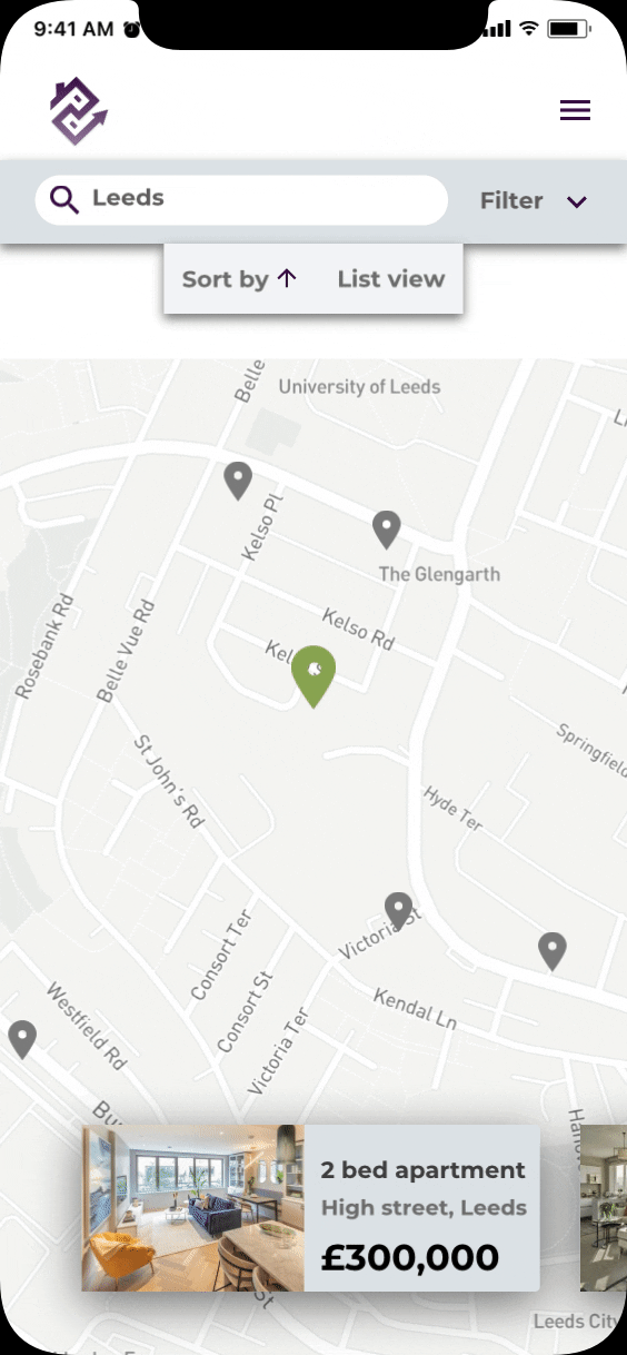
[Home] added map view option and a sort option so that the user can view data in a variety of ways.


-
[Input feedback for signup fields] added Input feedback on the signup screen.


-
[Map Screen] created a new screen for map view of properties.

Moodboards
In both moodboards, I created colour schemes, based on the colour suggestions of the brief - greens, blues and purples. I also focused on the investment element of the brief, that is, searching for an investment property rather than a home.
The fonts and images I've chosen speak to the brief of a "clean, quick and smart" product.
Moodboard #1 is directed towards the parental characteristic of the user, while moodboard #2 portrays their tech-savvy and business credentials.
.png)
Moodboard #2

Moodboard #1
I've chosen Moodboard #1. I feel the images, and the colour purple creates more of an emotional connection to the activity without being gender-specific while the greys, inspired by concrete, balance the emotional with the rational.
A comprehensive style guide is available here.


Design Guide
Visual Design
The final screens for my app reflect the visual direction from my initial mockup.


Responsive Design
The design process took a mobile first approach. Next, I created lo-fi wireframes to establish breakpoints for both tablet and desktop devices.
Landing Screen - Mobile

Landing Screen - Tablet

Landing Screen - Desktop


Prototype
Click on the landing page to view the final prototype in Invision

Animation created in Flinto

Retrospective & Next Steps

What went well
-
I identified a unique angle to the app, focusing on the investment element of the brief. This informed which features I created and the visual direction of the app.
-
I researched area information from a range of sources to establish investment insights which could be included as unique features. This sets Perfect Property apart from current property selling apps by providing comprehensive information on not only the property, but also the regional market trends, investment type and local demographic information.
-
The UI design is consistent across multiple devices. It balances comprehensive information in a variety of formats - text, charts, images and maps - while balancing the visuals with enough white space to focus the users attention.
-
The UI elements, the navigation and the animations follow established guidelines, allowing users to quickly get started and quickly complete tasks such as contact estate agents and save properties of interest.
Things I would do differently
-
I focused the design on the British property market, being the area I knew best. In retrospect, I would test the design with users from outside this market to investigate the potential of creating a more universal app.
Things to work on in the future
-
Given the restrictions COVID-19 is having on the property market, I would like to include a virtual tour feature for the app, with 360º images and a video tour.
-
I would create more animations to make it a more dynamic and engaging user experience.