

Overview
Vela is a weather forecasting responsive web app aimed at water sports users, from surfers to sailors, who want to plan their next day-trip on the water. The focus of the app is on accurate forecasting, with interactive weather maps, planning features and alerts features.
My role was to research and design high-fidelity prototypes.
Purpose & Content
This project was part of my UX Design Course, in order to illustrate UX design process from start to finish within the context of an app-building project.
UX Methods: Surveys, interviews, personas, user journeys, card sorting, A/B testing
Objective
The task was to provide beautifully displayed and easy to understand wind, wave and weather reports, forecasts and statistics for sailors, surfers, divers and any other water sport aficionado.
APPROACH
In order to deliver the project brief, I employed the double diamond strategy to discover, define and develop, engaging in competitor analysis, wire framing, prototyping and user testing.

Discover
The challenges this brief presented were:
-
marine weather forecasting is complex, due to how variable it can be and the number of factors which influence it.
-
different water sport activities are dependant on different wind, wave and weather conditions
-
Poorly calculated conditions can negatively affect a day on the water and even be dangerous.
Water sports users need a way to quickly understand accurate wind, wave and weather conditions so that they can interpret the best conditions and locations for their sport.
Researching the current market for marine forecasting apps and services, I discovered that:
-
overall, there are few apps within this niche
-
existing apps have little web presence or marketing strategies
-
apps are aimed at one market segment, for example, for surfing or sailing, but not both.
-
accurate services have little investment in the user experience
-
there is a wide age difference between the different water sports, for example, surfers range from teenagers to 40 years olds, while sailing has a much larger 40+ demographic.
Target Audience:
25-45 year olds, experienced in their sport & some understanding of forecasting
Functional Requirements:
Onboarding
Signup/Login
Profile Area
Homepage
Search Feature
Navigational menu
Displays for each forecast parameter (wind, wave, weather)
Customisable forecast displays
A way to send users alerts
A way to view local insight.
Interviews & Surveys
I carried out interviews with three participants, a body boarder, a surfer and a diver; and created a survey which was completed by 26 people. I analysed their responses, categorising them into which of their answers described tasks, feelings, influences, pain points or overall goals. Following this, I conducted affinity mapping, grouping interviewee's answers to find common themes.


Affinity Mapping
This process revealed some key insights including:
-
technology is allowing more people to get in to water sports which is adding to crowding, but an individual's experience will be an advantage for finding alternative spots.
-
Current services cover a lot but could describe wave breaks more.
-
Certain locations don't have accurate forecasting. Having information on topography would help a user to metigate this issue.
-
Many things influence weather patterns off shore, and experience is always required to anticipate changes.
-
water sports is often rooted in childhood and creates evocative stories.
-
all water sports involve a lot of planning including routes, accommodation, local services and services and equipment.
Allow users to save their favourite spots
Make maps a central feature
Add a variety of maps including topography, so that users can calculate conditions themselves
Add a planning feature
Include evocative images of locations
Provide both a summary of weather and an more in-depth forecast.
Define
My research brought me into the water sports world, developing an understanding of the type of person who depends on forecasting for their businesses and for their pastimes.
I created two personas:
-
The Professional, bringing to life their business needs to have accurate forecasting, and
-
The Surfer Dad, drawing focus on their time limitations.
Meet the personas
Sanders
The Professional

Sanders is a 43 year old business owner, based in Larnaca, Cyprus. He runs multiple dive centres across Cyprus.
Marine forecasts are a constant presence in his life and there's a multitude of sites he uses, along with tide tables and sailing maps.
"Doing anything that involves the sea and ocean means you need to have your wits about you all the time. Regardless of what tech you have, you still need to be able to read what weather is coming up."
Goals & Needs
-
Sanders needs to check the conditions daily in order to make decisions on the trips that day.
-
He aims to run as many trips per day as possible and avoid cancelling trips unnecessarily.
-
He needs to inform each centre of the daily conditions and what precautions to take.
Motivations
-
Sanders's priority is to keep his staff & customers safe.
-
Ultimately, he needs to make the business sustainable.
Frustrations
-
Accurate marine forecasting is more difficult to interpret.
-
Cancelled trips means disappointed customers and a loss of business income.
Everyday Activities
-
First thing in the morning is to check the daily weather forecast.
-
During the day, he will update social media to keep customers informed of any changes and to promote the dive centres.
-
Weekly, he holds meetings with each centre manager to review weekly activities and address any issues.
Device & Internet Use
Desktop Device
Mobile Device
Social Media
Tech Know-How
Motivations
-
He has limited time to dedicate to surfing these days so needs to make the most of those days.
-
He is still learning and want to be able to interpret conditions to find the best spots and hopefully discover new ones.
-
Kyle wants to build memories surfing with his children, just like he has of surfing with his dad.
Frustrations
-
Marine forecasting isn't always accurate.
-
Popular spots can attracts too many people
-
The topography on a spot, which plays an important role in understanding a location, isn't always available.
Device & Internet Use
Desktop Device
Mobile Device
Social Media
Tech Know-How
Kyle
The Surfer Dad

Kyle is a 34 year old father of two, living in Melbourne, Australia and working as a construction engineer
Between his family and work commitments, he finds less and less time to go surfing. He learnt to surf from his father and now he wants to do the same with his own children.
"Surfing is the best way to spend a day, the problem is finding that day when I have time and the conditions are right."
"Surfing is much more than just the surfing itself. Even when I'm not surfing I'm following other surfers on YouTube or comparing stories with other surfer mates."
Goals & Needs
-
Kyle wants to choose the best spot and time to take surfing day-trips.
-
He wants tech to be able to support his understanding of each location, especially new ones.
-
His goal is to set some time aside to be able to pass on his skills to his children.
Everyday Activities
-
Every weekday, Kyle commutes to & from work (40mins each way).
-
He takes over child care at the weekend while his wife works.
-
In the evenings, he surfs the internet and social media to stay connected with surf interest groups.
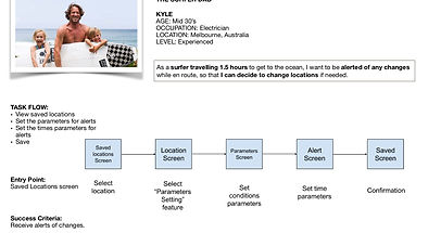
User Journeys


User Task Flows

Finally, I defined the app's information architecture, conducting card sorting with participants to review the initial site map, settling off the following site map.

Develop
During this phase, I created low-fidelity wireframes, to establish the app's layout in line with the user flows and site map.
Low-Fidelity wireframes of Login flow.


Mid-Fidelity wireframes of Setting alerts flow.
High-Fidelity prototype of onboarding flow.


Usability Testing
The goal of this test was to understand the learnability, efficiency and satisfaction of the app for first time users. To do so, I assessed:
-
the onboarding features of the app, establishing if the current pre- signup, swipe through onboarding clearly informs users of the features of the app and if further onboarding is required for the current features.
-
the home screen feature, inspecting users preferences for displays, elements they would like to see included and the learnability of it.
-
the trips feature, understanding how useful this feature is to users, how understandable the current layout is and anything users would like to be included or removed.
I set 5 tasks for the participants:
-
Navigate through pre-signup onboarding
-
Review the home screen
-
Add a location to their favourites
-
Creating a trip itinerary
-
Setting weather alerts
Errors were assessed using Jakob Nielson's scale:
0 = I don't agree that this is a usability problem at all
1 = Cosmetic problem only
2 = Minor usability problem
3 = Major usability problem
4 = Usability catastrophe
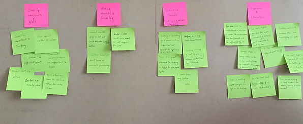
Analysing Test Results
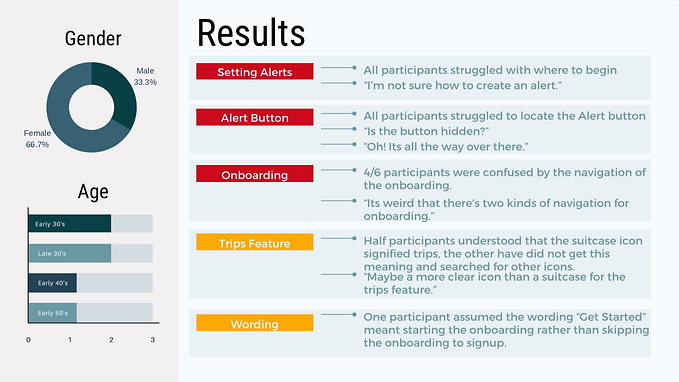
Affinity Mapping

The testing exposed that there were a number of issues around the Alerts feature. It highlighted a clear need to revise how this feature is introduced. It was also useful to demonstrate the different assumptions of each participant and the frustrations of an inefficient design.
Create onboarding to address the confusion around setting alerts and where the alerts button is located.
Add clear forward and back buttons for navigation through onboarding
Create onboarding for trips feature
Change onboarding wording to 'Create account'.
Polishing the Design
I reviewed the prototype's design using material design guidelines, iterated it according to the Gestalt Principles and reviewed the accessibility of the app.
Development of Screens


In preparation for final hand over, I created the design guide including setting a colour palette, typography guide and the tone of language.


Deliver
Final Screens & Mockups


CHALLENGES
The initial challenge I encountered with this brief was understanding the realm of water sports and weather forecasting. The overcome this, I used my professional and social networks to recruit a range of water users to discuss how wind, wave and weather patterns influence their sport. I asked them for links to websites and apps they prefer to use and asked why they preferred these services.
This process confirmed my assumption that different water sports are affected by different elements, for example, what’s a good condition for surfers, would be a bad condition for sailors. To overcome this, I designed Vela to have multi-layer maps so users can isolate the feature most important to each user.
Another challenge was recruiting a range of water sports users and diverse users. I needed to connect with users beyond my own network so I joined facebook groups for female surfers, sailing enthusiasts and anglers. It proved difficult to connect with sailors and anglers so I also researched webpages on each sport to better understand the different pain points of different users.
A third challenge was balancing accurate data with attractive UI. During the discovery phase, I noted that the accurate and most trusted sites and apps were not attractive for the user. Also, a lot of experience was required to understand the data and be able to interpret the wind, wave and weather forecast in relation to an area’s topography. To strike this balance, I made multi-layer maps a large portion of the apps screen, with both a summary and a more detailed forecast on top. The user can then interpret the forecast in relation to the area’s topography, and choose to investigate the map or the forecast further.
During the prototyping process, I discovered some limitations with the platform I choose to use for prototyping, Adobe XD. For transitions, it wasn’t able to swipe left-to-right, only right-to-left. This was proving a problem for correctly prototyping the onboarding screens. It caused some confusion during user testing and I feel caused a frustration for participants with the transitions between screens. Trying to correcting the issue with Adobe XD’s lack of this feature took considerable time. In the end, I decided to change the transition type from a drag to a tap. I felt this was the best compromise to be able to demonstrate the design of the app rather than redesigning about the platform’s limitations.